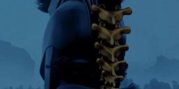
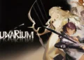
Adventure Time 100 Project
Cover Design: Jillian Crab with Art by Jeffrey Brown
Designer: Jillian Crab
Editor: Whitney Leopard
Artists: Chris Allan, Kristin Allen, Karl Altstaetter, Franco Aureliani, Mark Badger, Lucy Bellwood, Terry Blas, Dan Brereton, Jeffrey Brown, Dave Bullock, Chris Burnham, Daniel Campos, Richard Case, John Cassaday, Ethan Castillo, Ron Chan, Ryan Cody, Dennis Culver, David DeGrand, Leila Del Duca, Shannon Denton, Chris Eliopoulos, Rich Ellis, Gabe Eltaeb, Logan Faerber, Cat Farris, David Ferguson, Tony Fleecs, Jenny Frison, Agnes Garbowska, Jerry Gaylord, Penelope Gaylord, Chris Giarrusso, Benjamin Glendenning, Scott Godlewski, Sina Grace, Gene Ha, JJ Harrison, Lea Hernandez, Christopher Herndon, Tyson Hesse, Justin Hillgrove, Andy Hirsch, Thomas Hunter, Megan Hutchison, J Huw, Chris Ivy, Chris Johnson, Karl Kesel, Lukas Ketner, James Kochalka, Rich Koslowski, Braden Lamb, Ken Lashley, Emi Lenox, Joseph Michael Linsner, David Mack, David Marquez, Jose Marzan Jr., John McCrea, Chris Moreno, Jesse Moynihan, Todd Nauck, Natalie Nourigat, Michael Avon Oeming, Michael Oppenheimer, Mark McKenna, Dan Panosian, Tony Parker, Hannah Nance Partlow, Luke Pearson, Thomas Perkins, Joe Phillips, Carey Pietsch, Whilce Portacio, Gordon Purcell, Tom Raney, Bill Reinhold, Aaron Renier, Sara Richard, Andy Ristaino, Paolo Rivera, Tone Rodriguez, Craig Rousseau, Hainaru Saulque, Stuart Sayger, Bart Sears, Tim Seeley, Bill Sienkiewicz, Walter Simonson, Skinner, Greg Smallwood, Andy Smith, Wes St. Claire, Mark Stegbauer, Zachary Sterling, Ty Templeton, Nate Van Dyke, Mike Vasquez, Adam Warren, Doug Wheatley, Charles P. Wilson III, Tony Parker.
Publisher: BOOM! Studios/KaBOOM!
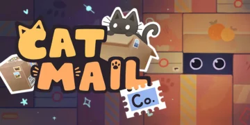
BOOM! Studios, Cartoon Network and Frederator Studios bring to our eyes Adventure Time 100 Project, a benefit in favor of the Hero Initiative which, for those who don’t know yet, helps to create a financial safety net to comic creators in need and does an amazing job at it.
A hundred sketch covers were mailed to a hundred different artists, with the intent of having them auctioned in benefit of the Initiative. The results are collected in a single volume and are gorgeous, with the characters of the franchise depicted in a wild variety of styles, from charming and whimsical watercolors to heavily inked hyperrealism. My favorite is Tony Parker’s vicious Finn, and all things Marceline – because Marceline.
I see the volume as a letter of love, both to the cartoon and to the Hero Initiative itself. For true fans of Adventure Time, this is a find to be treasured.
Overall: 10/10

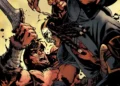
Batman: Prelude to the Wedding: Robin vs. Ra’s Al Ghul #1
Writer: Tim Seeley
Penciler: Brad Walker/Otto Schmidt
Inkers: Andrew Hennessy and Mick Gray
Colorist:Jordie Bellaire
Letterer: Dave Sharpe
Cover: Rafael Albuquerque & Dave McCaig
Associate Editor: Brittany Holzheer
Group Editor: James S. Rich
Publisher: DC Comics
The Bat-fangirl in me has been squealing in joy ever since the engagement between Bruce and Selina was announced, and the issues that are now preluding to the big nuptials are just as filled of fanservice as the promise of what’s to come.
In Robin vs Ra’s Al Ghul, Damian Wayne and Selina Kyle’s relationship take the center stage. We open with both at a taylor, being fitted for their wedding outfits, and it’s there that the contrasting formality of Damian’s ways, mixed with his teenage insecurities creates an awkward yet delightful little moment.
As the story proceeds and Damian uses of his skills to fulfill a guilty pleasure, he is attacked by an unknown enemy, a rival not only to his wits and strength, but also to his place within the Wayne family.
At first I thought, “oh, great, another member for the Bat-family shoehorned in,” but when the truth about the mysterious attacker was revealed it all made sense. With that, Damian is faced with his mother’s side of the family and the supposed duties an Al Ghul has to honor.
The ending is sweet without being saccharine, establishing a nice connection between Damian and his soon to be stepmother, and the prologue that follows paves the way for a big oomph in the near future.
At the last page, I was left with only one reassurance: I can’t wait to read more!
Overall: 8/10

Clankillers #1
Writer: Sean Lewis
Artist: Antonio Fuso
Alternate Cover: Juan Doe
Letterer: Dave Sharpe
Publisher: AfterShock Comics
Set in Ireland in an undefined time period that mixes the contemporary with old tradition, Clankillers does it’s best to bring a fresh twist on the revenge fantasy genre but falls a little short in its introduction.
The main character, Princess Finola, is introduced to us as a nameless rebel dropping names of several other characters we still know nothing about, and at that point I wasn’t so sure I should care about them. Only as the issue unveils, through a collection of scenes that focus more on the worldbuilding than in the story itself, we get to know Finola’s family, her friendships, and her biggest motivation: destroy all the four clans of Ireland, including her father’s, all to avenge the death of her mother.
While this first issue has a bit of trouble establishing a narrative and a proper pacing, the art alone is worth the purchase and the cliffhanger opens the potential for the actual story to unfold in a grandiose manner. Not a completely successful start, but the series is full of promises.
Overall: 5/10

The Crow: Memento Mori #3
Writers: Roberto Recchioni/Daniel de Fillipis
Artist: Werther Dell’Edera/Emanuelle Ercolani
Colorist: Giovanna Niro
Leterrer: Giovanni Marinovich
Editors: Marco Schiavone & Daniel de Fillipis
Publisher: IDW Publishing
When James O’Barr’s gothic tale of love and revenge first hit the shelves, it was a simple yet unique premise. Since the first time we saw Eric Draven in 1989, the story has been reinvented several times, with characters from different backgrounds filling the role of the titular Crow, and having read all of those iterations, I know for sure that a formula can only be reused so many times before it grows tiresome.
While the first two issues of The Crow: Memento Mori focus on building a past for the main character, David, giving him a more inventive death than his predecessors and a point of view heavily based on Christian mythos, issue #3 falls flat, bringing the narrative to the same prelude to the end as all others, with the revenge escalating until the point where the main target of the Crow’s pursuit is reached.
The art is gorgeous and the writing is beautiful and lyrical, with many quotes from famous philosophers and the Bible, just like in the two previous stories, but some twist to keep the story fresh is missing.
The short that accompanies the main attraction has good art but it’s a little confusing for its few pages, leaving it open to more questions than it has time to answer.
Although the reading was not completely satisfactory, the story still left me waiting for the ending, if only to fulfil my need as a The Crow enthusiast.
Overall: 6/10

Green Arrow Annual #2
Writers: Julie & Shawna Benson
Artist: Carmen Carnero
Cover Artist: David Lopez
Colorist:Trish Mulvihill
Letterer: Deron Bennett
Assistant Editor: Dave Wielgosz
Editor: Katie Kubert
Group Editor: Jamie S. Rich
Publisher: DC Comics
Non-superpowered heroes have always been my favorite for a reason: when confronted by unbeatable odds, their mere flesh and blood becomes a larger than life entity that, when in the hands of a capable writer, rises to the occasion without losing the sense and struggle that makes them human.
This is what happens in Green Arrow Annual #2. As the last member of the Justice League still in action, Oliver Queen is left with a mysterious box with a power that might be too big for him to control, and a target on his forehead placed by one of Brainiac’s spaceships, hovering above Seattle and wreaking havoc on its streets.
Alone against a threat way too big for his mouth to chew, the Green Arrow has to multitask, taking civilians to safety while trying to discover from where the the menace is coming from.
As one who has not read yet the issues leading to this story, I feel like it stands quite well on its own. The ending, however, is resolved off-panel, which is a bit disappointing, but that will probably be explained on issues to come.
Did I enjoy seeing Ollie take the main role in the middle of a “let’s call Superman” chaos when Supes was nowhere to be found? Heck yeah, I did. And I will definitely be following the rest of the story to see how it ends.
Overall: 9/10

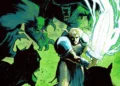
Jim Henson’s Labyrinth: Coronation #4
Writer: Simon Spurrier
Artists: Daniel Bayliss & Irene Flores
Colorist: Dan Jackson
Letters: Jim Campbell
Character Design: Kyla Vanderklugt
Cover: Fiona Staples
Subscription Cover: Rebekah Isaacs
Designer: Michelle Ankley
Assistant Editor: Gavin Gronenthal
Editors: Cameron Chittock & Sierra Hahn
Publisher: BOOM! Studios/Archaia
As a story within a story, Labyrinth Coronation as a whole has been doing an amazing job at telling us the origins of the Goblin King, all while using the original story as a background, tracing parallels between Sarah’s tale and the tale of Maria, Jareth’s mother, who found her son entrapped by magic beings and tried to rescue him from the Labyrinth.
Even though we’re supposed to know how the story is going to end, the idea is still fresh and enticing. The Labyrinth through which Maria travels is not the same Sarah encounters during the movie, which is a welcome change, and also different are the creatures and characters Maria encounters as she braves unknown lands.
In issue #4 we find Maria in a bind, imprisoned in a flying boat carried by fairies, mistaken by an outlaw. When she reecounters there the wannabe thief with a heart of gold, Skubbin, they find the help of a living rose bush tangle to escape and continue their search for baby Jareth.
Meanwhile, the Owl King, who has the young one captive, decides to cheat and contacts the father of the child to help on how to defeat Maria.
This issue seems to be a middle point within the story, so nothing incredibly impressive happens. Still, the writing holds up our attentions, the art continues to amaze, the colors are a feast for the eyes, and special mention to the lettering, which is incredibly creative and adds to the story in ways I haven’t seen in quite a while. Eager for issue #5!
Overall: 8/10
Patricia Loupee is a collector of skills: wannabe tattoo artist, seamstress, sculptress, cartoon artist, and most importantly comic book colorist, inker and writer. Her work in the world of comics can be seen at indie titles by Red King Press, Correct Handed Productions, Phoenix Dreams Publishing and the Boston Comics Roundtable anthology Being True.
Twitter: https://twitter.com/patricialoupee
Facebook: https://www.facebook.com/patricia.loupee/
Behance: https://www.behance.net/patricialoupee