Writer: Sean Gordon Murphy
Illustrator: Sean Gordon Murphy
Colors: Dave Stewart
Letters: DC Hopkins
Cover: Sean Gordon Murphy
Publisher: Massive Publishing
Summary
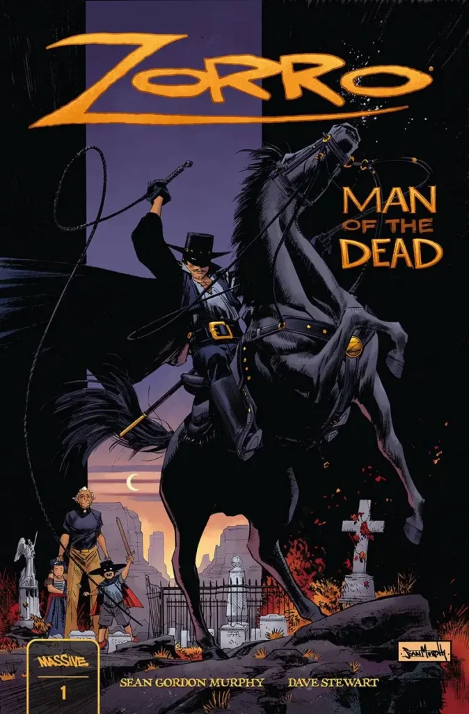
During a festival dedicated to Zorro, young Rosa and Diego de la Vega witness the horrific murder of their parents. Diego is whisked away to live in the castillo at the top of town with an adoptive father. Twenty years pass as he learns the art of fencing, and Rosa becomes a
delivery driver for the cartel because, as she puts it,“a blind eye is better than a slit throat.”
Things get pretty dicey for Rosa as she’s instructed to show some of the cartel members the way to the church. Ultimately, she has no choice and obliges.
The cartel members mortally wound Diego’s adoptive father. Before he dies, he gives Diego the original sword of Zorro. But Diego inherits more than just the sword, and believes himself to be the real Zorro.
Rosa turns against the cartel she worked for, essentially ensuring her own death. Will she and Zorro be able to keep the cartel from further destroying their town, especially now that there’s a target on their backs and the castillo at stake? I’m especially curious to find out!
Thoughts
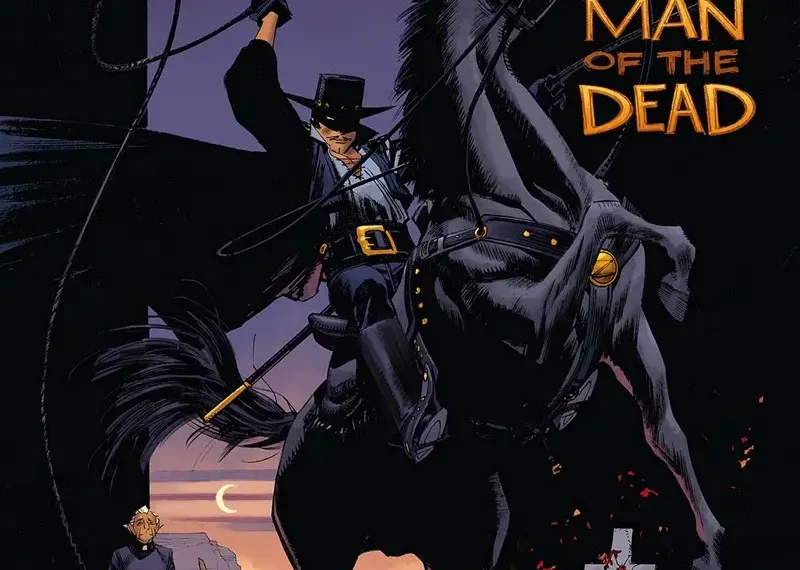
Zorro: Man of the Dead is a single artist vision, meaning Sean Gordon Murphy both writes and illustrates this thoughtful and sophisticated retelling and continuation of the story of Zorro.
Both Rosa and Diego go through a transformation in this issue. We are introduced to them as children, who then witness a tragedy, and we see how that event affects their lives into their adulthoods. There is a 20 year time leap, but the character development is clear.
I appreciated the combination of classic Zorro elements with elements from the Mexican holiday Dia de los Muertos, especially on the splash page on page two. The art is detailed and intricate and full of levity compared to the dark scene that follows.
Murphy’s panel-to-panel and page-to-page storytelling leave no room for confusion as the story folds out with clarity.Dave Stewart’s color palette and DC Hopkins’ lettering suit the style and mood of the story well.
Overall: 9/10

K.L.Murphy has BA in English, writes and reviews comics, and habitually pets cats. Comics are all unique and each one represents an enormous amount of thought and effort. Murphy reviews comics based on a variety of factors, but focuses on the artwork, storytelling, and pacing.