Feels like it’s been a while, doesn’t it? Well, let’s just hop in and talk comics, shall we?

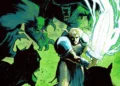
Batman/ The Shadow #1 (DC Comics/Dynamite Entertainment)
It’s really rare to see an inter-company crossover announced with this high-profile of a creative team. Scott Snyder and Steve Orlando writes this mini, with Riley Rossimo and FCA Plascencia on art. That should tell you this story is something special, and that’s what it is. An Arkham orderly named Lamont Cranston is murdered, and Batman falls down the rabbit hole of learning who Cranston is, as it leads directly to the Shadow.
This issue is a great primer on the classic pulp hero, as the entire issue is framed as a Batman story with the Shadow as its central mystery. It’s totally engrossing, and you want Batman to get to the core of the mystery. Rossimo’s art is already dripping with shadows and grit, which is perfect for both characters. Plascencia adds the perfect palette, with lots of deep red through the investigation.
Rating: 9 out of 10
The Verdict: Subscribe.

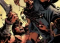
Conan the Slayer #7 (Dark Horse Comics)
Cullen Bunn has been dominating the comics world lately, and with new artist Admira Wijaya and color artist Michael Atiyeh, he kicks off a new story of Robert Howard’s barbarian. Conan and the Kozaks he now leads join up with a ship of pirates, and plunder a group of oppressive warriors.
The story is relatively short, with the bulk of it dominated by a sea battle. It’s a fabulous sea battle though. It’s a very classic Conan story, and even features callbacks to the classic Queen of the Black Coast story. The art is a great pairing, with the violence and ferocity of the battle coming across great on the page. Wijaya has a great sense of flow, which really helps this battles come across in a cinematic way. My only complaint is in the coloring, largely with how the battle was lit. At one point, it appears to be night, then daylight, then dusk, then the hold of the ship is as brightly lit as the scene outside. Though it takes the reader out of the story momentarily, overall it doesn’t take much off it.
Rating: 7 out of 10
The Verdict: Buy

Dragon Age: Knight Errant #1 (Dark Horse Comics)
I’m not much of a gamer at all, so I’ve never played Dragon Age. I actually don’t much about the property at all. I went into this issue blind outside of the high fantasy genre. I have to say, I really enjoyed it.
This is the story of the elven squire Vaea and her lord, Ser Aaron, a knight errant. Vaea is not just a squire/knight in training though. She’s also a skilled thief, and that talent gets her in trouble.
Christina Weir and Nunzio DeFillipis have been around in the comics world for a long time, so they know how to tell a great story. They craft a group of very interesting characters here. Vaea is not your standard D&D style elf, and she clearly is a fun protagonist. Fernando Heinz Furukawa supplies the line art, and crafts a wholly lived in world. There’s a great variety to the characters, and he really excels in the dialogue free thieving scenes.
Rating: 7.5 out of 10
The Verdict: Buy if a fantasy fan.

Faith #11 (Valiant Comics)
It’s really disappointing that this series is ending next issue. Jody Houser and her various artistic collaborators have done a fabulous job with Faith Herbert for the past year and a half, taking her from a caricature to a really solid female hero. In this issue, Houser continues her collaboration with Joe Eisma, as the Faithless continue their attack on Zephyr.
It’s a fairly standard superhero plot, with the group of villains dismantling the hero’s life. Houser has fun with it though, and Faith’s optimism really carries the plot. Even though she’s at her lowest, she doesn’t sink into despair. Eisma’s work feels a little rushed compared to his past work, but it still looks great. I really like his depiction of Faith, and the villains feel like their own presence in the story, not just part of a small crowd.
Rating: 7.5 out of 10
The Verdict: Buy

X-Men: Gold #3 (Marvel Comics)
Mark Guggenheim is probably the most underrated writer from Marvel’s staple (which is funny considering his position in DCTV’s Arrowverse). I’ve enjoyed everything of his that I’ve read though. His Blade run with Howard Chaykin is one of my favorites, and his Spider-Man and Wolverine runs are great. So seeing him on the flagship X-Men book really excited me. As his first arc on the series wraps, how does this rate though?
Issues 1&2, despite the controversy from artist Ardian Syaf, were very solid, and a return to form for the X-Men from the perpetually on-the-run, threat-of-extinction stories they’ve had for the past decade. This issue stumbles a little bit after the strong start. Half of the new Brotherhood is dispatched by Logan off-screen, while the other half makes for a more interesting conflict. The ending is a bit cliched, with yet another anti-mutant bigot stoking fear towards mutants. As for the positives though, I think they outweigh the negatives. This is a fun book, and really sells the “X-Men as heroes” mission statement. Rachel Grey is a particular highlight, as her snark adds a lot to the team.
Taking the art only on its own merits, Syaf had developed a great new style for himself here, a cross between Jim Lee and Marc Silvestri. It’s really hard to say anything beyond that though, as he really shot himself in the foot with his politics. He could have had a great career from here. I’m really looking forward to Silva and Lashley’s work in the coming issues though.
Rating: 7 out of 10
The Verdict: Buy, subscribe if an X-Fan.

X-Files #13 (IDW Publishing)
Joe Harris, Andrew Currie and Sebastian Cheng continue their post-Season 10 chronicles of Mulder and Scully by focusing on one of the series most beloved supporting characters, Director Skinner. In the issue, Skinner is faced with the ghosts of his past, literal and figurative (as cliched as that sounds).
Harris weaves a great story here. Naturally Skinner would have encountered the supernatural in the past, and here he comes face to face with a demon that had haunted his unit from Vietnam since they’d been involved in a slaughter of civilians. My complaint is that it felt a bit rushed. There was a lot of information missing, but being the second part of the story, I may have missed a bunch of information in the previous issue. The ending was also a bit abrupt, with a sort of unclear resolution.
Currie and Cheng do a great job with the art and colors as well. The characters are on-model without feeling photo referenced, and it has a great sense of motion throughout. Even Mulder and Scully sitting and reading a file is interesting. The art does suffer in a few instances from a case of anime eyes though- eyes that are too big for the character’s face, particularly with Scully. Overall though, it was a decent story , and a great read for a long-time X-Files fan.
Rating: 6.5 out of 10
The Verdict: Buy if an X-Files fan, pass if not.

Youngblood #1 (Image Comics)
Image’s original series returns, written by Chad Bowers, with art by Jim Towe and color art by Juan Manuel Rodriguez. This is actually a really fun take on Youngblood. Young heroes are now using an Uber-style app to find situations that require their talents. When one of them disappear, his closest friend dives into the mystery of what happened. Meanwhile, the original Youngblood rallies to find these young heroes and make sure they’re not doing more damage than help.
Bowers tells a brisk story, with an interesting mystery, as well as bringing back the classic Youngblood characters. This feels like a true passing of a torch, but it’s also a fresh start for someone like me who knows nothing about Youngblood. Towe’s work is good as well. It’s not spectacular, but it’s very solid. Definitely better than the average superhero book.
Rating: 7 out of 10
The Verdict: Buy

Ghostbusters 101 #1 (IDW Publishing)
Erik Burnham and Dan Schoening’s ongoing Ghostbusters adventures are probably the highlight of the nostalgia-filled licensed comics published by IDW. Everything they’ve done has furthered the story, from the ongoing, to the TMNT crossover, to the international adventure, and now this series. It’s been a great progression, and Burnham has shown his characters grow, as well as his cast. Janine has rightfully become a full-blown Ghostbuster. Ray has been shown his destiny. We’ve seen additions like Kylie Sanchez, and the franchised teams. Now they’ve expanded more into the Ghostbusters multi-verse, to feature the Answer the Call team from last year’s feature film.
Burnham and Schoening work perfectly in tandem. While the bulk of the issue deals with the classic team, the latter portion with the new team is wonderfully done. Dan’s art captures each character well, and Burnham’s script is spot on. I could hear each character’s voice as I read it, both Bill Murray and Melissa McCarthy. The only downside is that this issue is entirely set-up, with only a hint of what brings the teams together, which means I can only recommend buying it, instead of subscribing.
Rating: 8 out of 10
The Verdict: Buy

Grass Kings #1 (BOOM! Studios)
Matt Kindt has rapidly climbed to near the top of my favorite authors in comics right now. Pairing him with Tyler Jenkins, former artist of Image’s Peter Panzerfaust, is an exciting prospect. The book itself is a beautiful look at a lawless lakeside community, the Grass Kingdom, who spurn outsiders. The story is little more than a tour of the community as an outsider is driven out of it and threatened repeatedly by its sole police officer.
Kindt takes his time here, stepping out of Jenkins’ way, while building his new world. This is an ordinary world, but the inclusive ane and xenophobic nature of the Grass Kingdom makes it seem just as fanciful as any strange world. It’s a great bit of world building all in just 32 pages. The world is fascinating, and the hints of the character we get are very intriguing. Jenkins supplies absolutely jaw-dropping visuals. He’s painted in watercolor over his pencils, giving each page a dreamlike quality. The pencils are a bit on the sketchy side, but here with the painted colors, it works great. A beautiful book!
Rating: 9 out of 10
The Verdict: Subscribe

WWE #3 (BOOM! Studios)
I am not a wrestling fan, but I love Dennis Hopeless’s Marvel work. So based on that, I checked out Boom!’s WWE #3, written by Hopeless, with art by Serg Acuna and Doug Garbark. The issue is centered on Seth Rollins, recently crowned Superstar and Champion, in the middle of a medical emergency. Hopeless takes us through his recovery, loss of motivation, and getting fired back up.
Hopeless tells a really fun story here. It’s one we’ve seen a lot in sports movies, but there’s a lot of fun personality injected into it. Acuna’s art is pretty straightforward, but for a licensed title, his hands were probably tied pretty strictly. It looks good, though. The only quibble is that Seth Rollins and Roman Reigns look way too similar in the last few pages.
Honestly, it’s not a book I’d pick up again, just because I’m not a WWE fan, but for fans, it definitely feels like it’s worth picking up.
Rating: 6 out of 10
The Verdict: Buy is a WWE or wrestling fan, pass if not.
Tony Thornley is a Mormon geek dad, blogger, Spider-Man and Superman aficionado, amateur novelist and all around awesome guy. He was born and raised in Utah and has been reading comics since age five. His first comic series was GI Joe and he was doomed from there. You can follow him on Twitter @brawl2099.