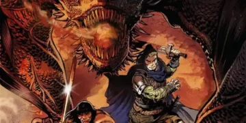
Writer: Rick Remender
Illustrator: Paul Azaceta
Colours: Matheus Lopes
Letters: Rus Wooten
Cover: Paul Azaceta
Cover B: Jordi Lafebre
Cover C: Kent Williams
Cover D: Wes Craig
Published by: Image Comics
Summary
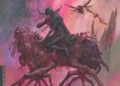
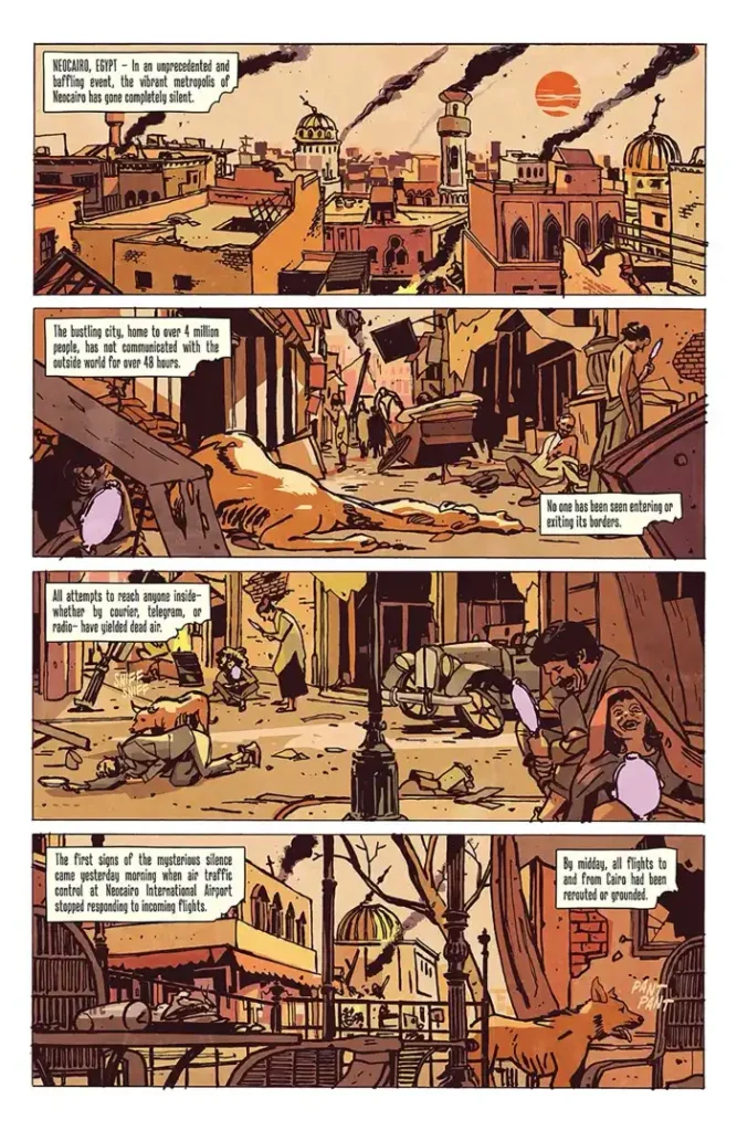
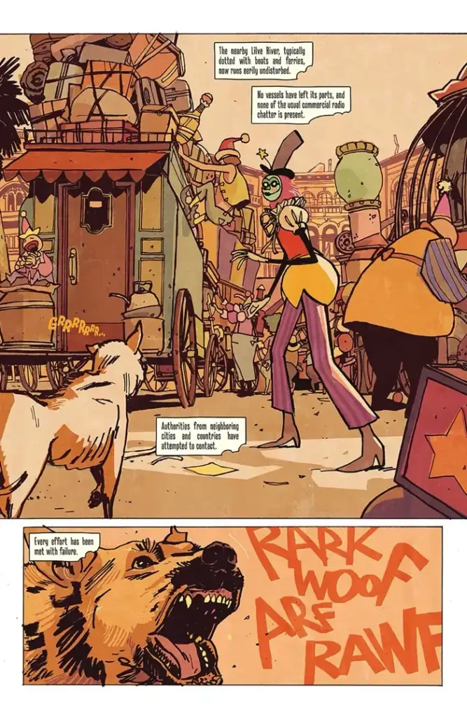
The comic begins with the mysterious silence of the city of Neocairo. No one has been able to contact anyone inside for days. A circus caravan packs up on their way to leave Neocairo as a singular clown looks back and remarks that they are “needed elsewhere.”
In the next scene, we meet our main character, Spring, as she’s talking to a goldfish strapped to the back of the moped she’s riding. Spring is trying desperately to catch a letter that’s blowing in the wind through the streets of her town, New Gualia. While haphazardly making a path through the town on the moped–we learn through her interactions with the townspeople that Spring Seasons is the local letter courrier, and she’s earned herself quite the reputation as a troublemaker, too.
After all, she does smash into cupcakes, climb a billboard, and crash through several people before she reaches that letter.
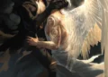
In the letter, Spring’s sister Autumn reveals a shocking discovery and a mysterious warning, just in time for the circus to arrive in town.
Thoughts
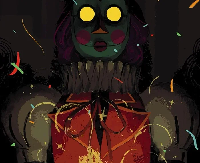
The Seasons opens with a scene of a circus leaving a town that is reported to have gone virtually silent. The circus characters are colorful and delightful to look at, but you can tell there’s something off about them by the chaos they seem to be leaving behind them. Later, when Autumn Seasons is introduced, we see that she’s willing to protect herself from a group of clowns, potentially with deadly force. These ominous scenes hint at something darker yet to come, and I don’t think we fully learn what that is in this first issue. Does the silencing of Neocairo foreshadow an end for New Gualia? Or Spring? Does this circus represent a catalyst to chaos?
This comic is double length, but it feels like a flash even though most of the issue is about Spring chasing a letter. There’s a whole adventure that happens in just moments, and then it’s over before you know it. The swift pacing guides the reader through the issue almost like watching a movie, giving it a cinematic feel.
There’s a bit of exposition at the beginning and end of the issue, with little bits sprinkled in throughout Spring’s adventure, but it doesn’t weigh the story down at any point. There’s this levity and lilt in Spring’s letter chase that’s nicely juxtaposed against Autumn’s more noir and sublime letter-writing scene.
Writer Rick Remender and artist Paul Azaceta work well together to create a story that shows you Spring Seasons’ world. They’ve created a whimsical and charming comedy with a sinister undertone that’s fantastic to look at. The acting in Azaceta’s artwork is convincing, and Matteus Lopes’ colors on Azaceta’s linework is captivating. It compliments the story itself as well as the artwork. The comic is bookended with a darker palette on the ominous opening and closing scenes, and vibrant and bright during the chase in the middle, which seems to feature Spring and Autumn in their respective seasonal tones.
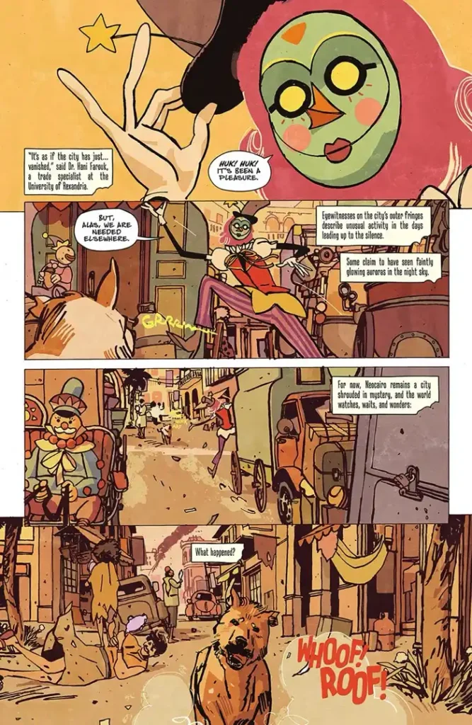
Rus Wooten’s lettering aligns nicely with the artwork and enhances the flow of the comic. This issue isn’t text-heavy, and Wooten’s touch is subtle yet effective. For example, the newspaper clip design for the Global Gazette article was creative and inviting. It’s an effective way to disperse exposition and narrative that pulls the reader into the story as if they were themselves part of this world.
This team works together with a maturity that leaves me eager to see issue two.
Overall: 10/10
K.L.Murphy has BA in English, writes and reviews comics, and habitually pets cats. Comics are all unique and each one represents an enormous amount of thought and effort. Murphy reviews comics based on a variety of factors, but focuses on the artwork, storytelling, and pacing.