Written by: Jeff Lemire
Art by: Andrea Sorrentino
Colour by: Dave Stewart
Letterer: Steve Wands
Cover: Andrea Sorrentino
Published by: Image Comics
Spoiler Warning
Sometimes as a reviewer, you get a chance to take an early look at a book that you know is going to be something special. It’s a privilege that’s a bit of a thrill, because you want to tell the world about the book without telling too much.
In this case, I’m talking about Gideon Falls from Jeff Lemire and Andrea Sorrentino. This duo is a very well known creative combo at this point, between their acclaimed runs on Green Arrow at DC and Old Man Logan at Marvel. Naturally seeing them on a creator owned book is exciting.

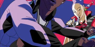
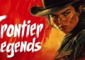
Gideon Falls is the story of two men. The first is Father Fred, a Catholic priest taking over the the parrish at Gideon Falls. Fred clearly has skeletons in his closet, and is reluctant to take the post. The other main character is Norton, a young man in a surgical mask apparently coping with mental illness. How the stories connect isn’t clear, but there’s clearly more on the surface than we readily see.

Lemire creates a fascinating mystery here. There may be something supernatural at work, but outside of those hints, this is a great noir tinged mystery. Father Fred is an unconventional lead- an older man of faith- which definitely makes him an interesting window to the story being told. I’m not sure how Norton fits yet, but his quirks and possible illness will definitely make the overall story even more interesting. It meshes together very well though, and creates an immersive new world for us to dive into.

The art, by Sorrentino and color artist Dave Stewart, is the star in this issue. Sorrentino is a master of page layouts, drawing focus to important moments, picking up the pace of other scenes. I genuinely can’t think of anyone in comics right now who can lay out a page that well. It creates a great feel, and deepens the reading experience. Stewart’s palate is very muted, which helps the tone that Lemire’s story sets.

The only issue where the story falls short is in the lettering. Though Steve Wands does some interesting thing with fonts here, some of his caption boxes are black boxes with white text, which can be difficult to read digitally. It’s a great style choice and visual, but made the book a little difficult to read in a few places.
Overall though, it’s a very interesting first issue, with a hook that’ll bring me back for more.
Overall: 8/10
On sale March 7th
Tony Thornley is a Mormon geek dad, blogger, Spider-Man and Superman aficionado, amateur novelist and all around awesome guy. He was born and raised in Utah and has been reading comics since age five. His first comic series was GI Joe and he was doomed from there. You can follow him on Twitter @brawl2099.