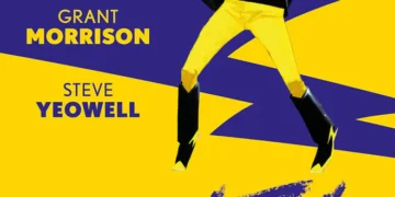
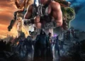
Written by: Mark Waid
Art by: Chris Samnee
Colours by: Matthew Wilson
Letters by: Joe Caramagna
Cover by: Chris Samnee
Published by: Marvel Comics
Marvel’s Legacy initiative continues this week with perhaps the most anticipated of the announced titles- the return of Mark Waid to the Sentinel of Liberty, alongside his long-time collaborator Chris Samnee.
To say that Steve Rogers, and Captain America has been through a lot in the last couple years is an understatement. First, at the end of Rick Remender’s run on the characater, he had the super-soldier serum ripped from his system, reverting him to his natural age. Then Steve was restored to his vitality about two years later, only to discover the restored Steve was actually an evil clone created by a Cosmic Cube (yes, I’m over-simplifying). The original Steve returned just in time to defeat his evil self, who had nearly destroyed the United States. That’s where Waid and Samnee pick up, about three months after that momentous battle.

Steve returns to Captain America, Nebraska, a small town he once saved from white supremacists, and who renamed itself in his honor. After showing what the icon truly means, the supremacists- Rampart- reveal themselves, and Cap is able to save the day.
Waid and Samnee, at this point in their collaboration, are in perfect lockstep. The duo are credited jointly as “storytellers” and that is an accurate assessment of their contributions. This feels like the work of two creators who love the character they’re working on, but it goes beyond that. Too often stories like this turn into nostalgia porn, but with Cap at the center, they’re able to convey his humility wonderfully as well. He doesn’t like to have a fuss made about himself. He’s a humble man who simply does good.
Samnee’s art is absolutely perfect to bring Cap back to his roots. His line is classic and slightly cartoony. He’s also a master at conveying emotion. For example, Steve’s confusion about being called an “icer” is wonderfully placed on the page (and it’s a gag I won’t ruin here). The action is great as well. In one moment, Cap’s iconic shield slices through Rampart’s weapons, and it’s so simple but effective.

Color artist Matthew Wilson is at the top of his game. Though Cap himself is in his usual primary colors, Wilson uses his colors to effectively show mood, emotion, and danger. Without Wilson, one of the most effective and classic panels in the book wouldn’t have worked nearly as well.
Simply put, if Secret Empire had shaken your faith in Captain America as a concept or Steve Rogers as a character, you MUST read this issue.
Welcome back Cap. We missed you.
Overall: 9.5/10
Tony Thornley is a Mormon geek dad, blogger, Spider-Man and Superman aficionado, amateur novelist and all around awesome guy. He was born and raised in Utah and has been reading comics since age five. His first comic series was GI Joe and he was doomed from there. You can follow him on Twitter @brawl2099.