The Raid #1, #2, and #3
Writer: Ollie Masters
Artist: Budi Setiawan
Colors: Brad Simpson
Letters: Jim Campbell
Cover: Ben Oliver, Claudia Iannicello, Roy Allan Martinez
Publisher: Titan Comics
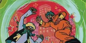
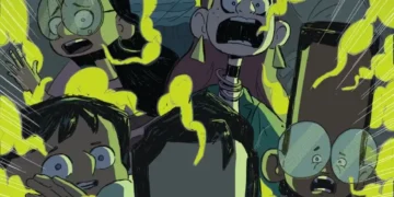
I love The Raid: Redemption and I really cannot recommend it enough, but when I learned of a comic sequel series I wondered how if it could translate the amazing choreography and cinematography into comic form. With the passing of Norm Breyfogel this year, and examples of his work flooding social media I learned that fight scenes in comics could be stunningly kinetic which put my expectations much higher, sadly these comics couldn’t meet them. The art is good, but the action is pretty standard fare and the tone as shown through some interesting narration choices are way off. The movies the villains were shown to be amazingly skilled badasses by what their actions the comic instead straight up tells you, breaking the classic ‘ show don’t tell’ rule leaving me to dock it a bit to 8/10. The second and third issue are much better in action and tone and does a good job bringing everything together as well as raising the stakes and I’m eating you in the new characters. I hope it can keep the quality 10/10 for both #2 and #3

Immortal Men #5
Writer: James Tynion IV
Artist: Tyler Kirkham
Colors: Arif Prianto
Letters: Carlos M. Mangual
Cover: Tyler Kirkham
Publisher: DC Comics
While I stand by my statement that for the most part DC’s New Age of Heroes feels a lot like Marvel Immortal Men may be the exception to the rule as it feels a lot like early Image. The problem for me with that is a lot of early Image was hit or miss for me, and I’m walking into this series at a particularly bleak point though it is not without humor. My favorite character of the bunch is Timber. She’s a homage to Apache Chief from the Super Friends cartoon with a smidge of Paul Bunyan and now all I want to do is see her turn into a giant woman 10/10. If you like early Image comics like Witchblade, Brigade, and/or Cyberforce I think you’ll get a kick out of this.

2021: Lost Children Vol. 1
Writer: Stéphane Betbeder
Artist: Stéphane Bervas
Colors:Massimo Rocca
Translator: Jessica Burton
Cover: James Stokoe
Publisher: Titan Comics/Statix Press
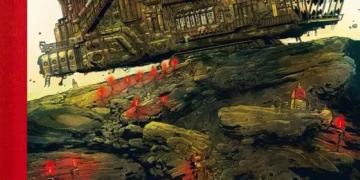
First, the plot: A powerful telepath has taken over an American city and a crack force of genetically engineered children are sent in to stop him. Now, the elephant in the room: The art is computer generated. I’m not calling attention to this as some kind of snob suggesting I will only accept hand drawn comics, but rather I noticed it and want to acknowledge the progress as well as some of the lingering weaknesses of CG comics. Firstly the hair problem, with Poser (or programs like Poser) most hair looks terrible other than a few rare exceptions. To counter that most of the characters have close cropped hair, shaved heads, or their heads are covered. Secondly the textures, I don’t know if this is a general improvement or some innovative work by the artist but the colors and textures for the characters were terrific, the backgrounds flagged a bit but that has a bit to do with the rigid ultrarealism of most cityscapes. Finally awkward positioning, with these programs you are manipulating wireframe models and at times you end up unnatural stances, there was remarkably very little of that, in fact I’ve seen some hand drawn comics with worse. There was one glaring problem though and that was the use of the built in lettering program, I feel hiring a letterer would have been a wiser decision. What it comes down to with my final judgement is while the art did competently service the plot I didn’t feel any moment where the art transcended into a moment of excellence. While not my cup of tea it’s a solid book that shows that CG art is going places 10/10.
James L. Sarandis is a husband of one, father of two, and writer in three fields (comics, books, and film). Want to see my current labor of love? Check out EYE HAND VOICE at www.eyehandvoice.the-comic.org.


